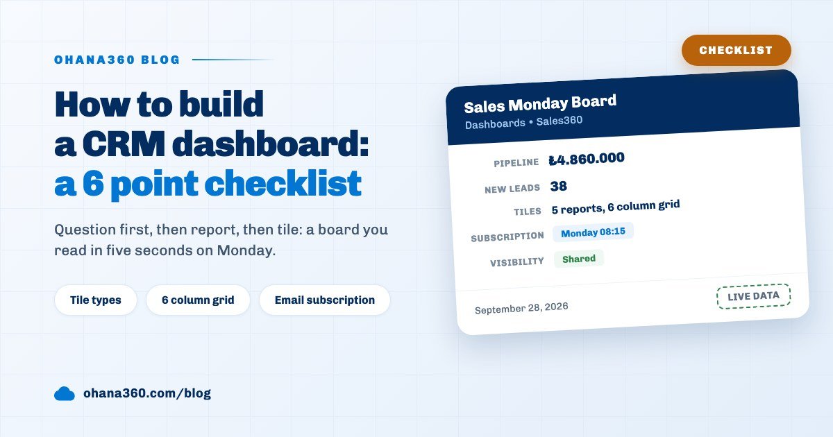
To build a CRM dashboard, first write down the 4 to 6 questions it has to answer, save one report per question in the Report Builder, then create a new dashboard on the Dashboards tab, pick those reports and size the tiles on a six column grid. The last step is sharing and an email subscription for Monday morning.
Ohana360 is a business cloud that keeps sales, service, marketing and industry records in one database; Reports and Dashboards are the last two tabs of every app. We covered how to build the report itself step by step in the sales reports guide. This article takes the next question: once the reports exist, how do you design a board that can be read in five seconds on a Monday morning?
What is the checklist for a good CRM dashboard?
A good CRM dashboard rests on one reader, a small number of questions and one number or chart per question. Answer the six points below on paper before you start building; any point left unanswered comes back as a tile nobody looks at.
- Give the board one reader. A sales manager's board is not a sales rep's board. The manager looks at the team total, the rep at their own work.
- Write the questions first, six at most. Such as "How big is the open pipeline?" or "How many leads came in this month?". On a wide screen the summary strip shows 6 boxes in one row, and the subscription email carries the first 6 reports.
- One report per question. Name the report so that it answers the question: "Open pipeline total" shows up as the tile title exactly as written.
- Make a single number an ungrouped report. A report without grouping becomes a KPI card on the board, one big number.
- Decide the time window up front. Date filters take a fixed date; there is no relative "this month" option. We explain below how to handle it.
- Set sharing and delivery. The Shared box opens the board to the team, and a subscription carries it to email on the day and hour you choose.
Which questions should go on a dashboard?
A dashboard should hold the questions someone counts by hand every week or asks in a meeting. For a sales manager these are usually the open opportunity total, who holds that total, the number of new leads and how closings spread across months.
The image above is a six question board built inside Sales360. Each row shows the question, the Report Builder setting that answers it and the tile that results. Two points to watch:
- Stage values appear by their data names. Opportunity stages are stored as Prospecting, Qualification, Proposal, Negotiation, Closed Won and Closed Lost, and that is how they are listed in report filters and group labels. "Open deals" means leaving the two closed stages out with "not equal to" filters. Filters always combine with AND, so both rows apply together.
- One board, one app. The new dashboard window only lists reports built on the objects of the app you are in, plus the Account, Contact, Task, Event and File objects that are shared everywhere. A Service360 case report cannot join a board opened in Sales360; build two boards for sales and service.
If the stages themselves are not settled yet, read the sales pipeline stages guide before the dashboard; a badly defined stage misleads every tile on the board.
KPI card or chart: which tile should you choose when?
The tile type is decided by the report's grouping and chart type: an ungrouped report becomes a KPI card showing one big number, and a grouped report is drawn as the bar, donut or table chosen in the report. The table below sums up which tile fits which question.
| Tile | How the report is set up | Which question it fits | Watch out |
|---|---|---|---|
| KPI card | No grouping; metric Record Count, Total or Average | "How much?", "How many?" | Shows no change against the previous period |
| Bar | Grouping + chart type Bar | Comparing people or months | Labels tilt beyond 6 groups, names longer than 16 characters are shortened |
| Donut | Grouping + chart type Donut | Share of a whole | The legend shows the first 8 groups with percentages, the rest as "+N more groups" |
| Table | Grouping + chart type Table | Lists with many groups to read | Always has a count column, plus a value column when Total or Average is chosen |
A practical rule: if the person looking at a tile has to read the answer in two seconds, use a KPI card. If they want to see who is ahead or which month fell short, use a bar. Keep the donut for shares with five or six parts; a twelve slice donut cannot be read. Each tile carries the report's headline number in its header and an Open in Builder link underneath that opens the report itself.
Text, picklist and date fields can be used for grouping; number fields cannot. If you want to group by your own picklist or formula field, the type choice in the custom fields guide applies here too: a formula field enters reports as text, so it can be grouped but not summed.
How do you build a dashboard and size its tiles?
Once the reports are saved, a dashboard takes four steps, and its tiles are sized on a six column grid. Standard reports cannot go on a board directly; you open one and save it under your own name first.
- Save the reports: on the Reports tab, build one report per question, or open a template with the Standard badge and save it under a new name.
- Create a new dashboard: click New on the Dashboards tab. The dashboard name is required, the description is optional.
- Pick and order the reports: the reports you tick move to the top, and the up and down arrows change their order. That order is the tile order on the board. It will not save without at least one report.
- Choose sharing and save: with the Shared box ticked everyone in the org sees it; otherwise the board is personal.
Open the saved board and click Edit to put the tiles into edit mode. Grab a tile and drag it elsewhere; the blue handles on the sides change the width, the bottom handle the height and the bottom right corner both at once. While you resize, the tile shows how many columns and rows it covers. The same mode has an Add report list, a Name & Sharing button and Move earlier, Move later, Expand and Remove buttons on each tile; changes stick when you click Save.
The grid rules are fixed: a tile is at least 2 and at most 6 columns wide, and a newly added tile comes at 3 columns. Height is set between 1 and 7 rows, which is 120 to 600 pixels. Because the narrowest tile is 2 columns, a row fits three tiles at most; the way to show four KPIs side by side is not tiles but the summary strip on top of the board. That strip appears on its own on every board with more than one report, lines up the headline number of each report and scrolls to the matching tile when you click a box.
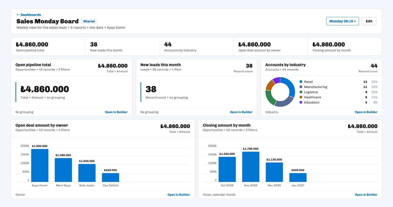
In the sample board above three tiles show the same number: the open pipeline total, its split by owner and its split by month use the same filter, so all three write the same total in the strip. This is not a bug but a signal: instead of showing one total three times, leave the total to the KPI card and move the breakdowns to chart tiles.
How do you build a "this month" tile?
Because Ohana360 reports have no relative date filter, a "this month" tile is built in one of two ways: update the filter date at the start of each month, or group by the date field per month. Both have a plus and a minus.
- A fixed date filter: a filter such as Created on or after 2026-09-01 counts the records that came in from the first of September. The number is clean and fits a KPI card, but at the start of October someone has to open the report and change the date. Tying that job to a task that repeats on the first day of each month keeps it from being forgotten.
- Calendar month grouping: grouping by the date field with the date setting on calendar month shows each month as its own bar; when a new month starts, its bar appears by itself. Choose the oldest first group order and the months line up left to right in time order. The same list also offers day, week, quarter and year.
Using both gives the most readable result: this month's number in the strip, the last months as bars below. A monthly bar by close date also shows the expected closings of the coming months, and opportunities whose close date has passed but that are still open show up as an old month on that chart, which tells you it is time to clean up.
How do you share a dashboard and send it by email?
To share a dashboard with the team, tick the Shared box; for regular delivery, pick a frequency from the subscription button in the header. The board is drawn from live data, so whoever opens it always sees the current number.
| Setting | Options | Detail |
|---|---|---|
| Visibility | Personal or Shared | Personal is seen by you and admins; Shared by everyone in the org |
| Editing | Owner and admin | Other users open the board but do not see the Edit and Delete buttons |
| App | The app it was built in | A board built in Sales360 is listed on the Sales360 Dashboards tab |
| Subscription frequency | Daily, Weekdays, Weekly, Monthly | Weekly asks for a day, Monthly for a day between the 1st and the 28th |
| Subscription time | 00:15 to 23:15 | Turkey time, sent at quarter past the hour you pick |
A subscription is personal: everyone sets one up for their own address. A dashboard subscription sends the first six reports on the panel stacked as tables in a single email; a manager's Monday 08:15 subscription drops the week's table into the inbox before the team meeting. In orgs with a connected Meta ad account, a ready made Ad Performance panel also appears at the top of the Dashboards tab for each synced ad campaign; you do not have to build it.
Not included: what a dashboard does not do
- No relative date filter. Options such as this month, last week or last 30 days are not in report filters; a date filter takes a fixed day.
- No board level filter. Each tile uses the filter of its own report; an owner or period filter cannot be applied to all tiles from the top of the board.
- Three chart types and a KPI card. There is no line, area, funnel or gauge chart and no target line; change against the previous period is not shown either.
- No drill down from a tile to records. Clicking a bar or a slice does not open the matching records; the Open in Builder link under the tile opens the report.
- A board takes reports from one app. Sales and service reports do not combine on one board; shared objects (Account, Contact, Task, Event, File) can be picked in every app.
- Case and lead reports have no Owner field. A per rep case or lead tile cannot be built; Owner grouping exists in Opportunity, Account, Task and Event reports.
- Group labels are the raw stored values. Values appear exactly as stored: case and lead statuses, for example, keep their stored Turkish names in an English interface, and a separate display name cannot be set for a tile label.
- Standard reports cannot be added directly. A board is built only from saved reports.
- The subscription email is limited. No chart is embedded; the first 6 reports and the first 30 groups of each report arrive, a report with an Average metric carries only the count column, and date grouping is kept in the email only as calendar month.
- It does not go on the home page. A dashboard is not a component embedded in an app's home page; it opens from each app's Dashboards tab.
What is the most common mistake when building a dashboard?
The most common mistake is putting every report you have on one board: on a twelve tile board the eye does not know where to look, and within two weeks nobody opens it. A board is not a shop window for reports but the agenda of a specific meeting.
A routine that works: tie the board to a meeting, for example the Monday sales meeting. Every question asked in that meeting becomes a tile, and nothing that is not asked does. After a month, ask which tile nobody looked at and remove it. The tidier the records behind the board, the more reliable the numbers; Sales360 records are the main source of the board, and for site traffic you can build a separate board inside Analytics360, because its daily traffic records work in reports and dashboards the same way.