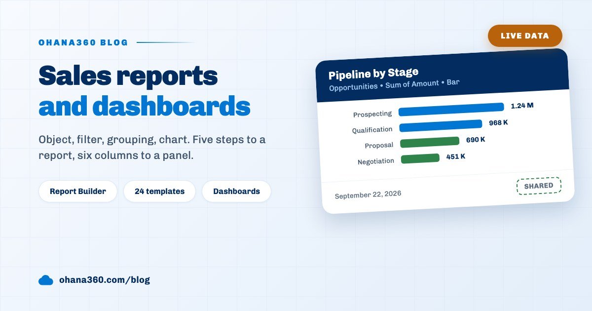
A report in Ohana360 takes five steps: pick an object, check the columns, add filters, choose a grouping and a metric, then pick a chart type and name the report. Ohana360 is a business cloud that keeps sales, finance, service and HR records in one database, and Reports and Dashboards are the closing tabs of every app.
The concrete output is this: in fifteen minutes, a bar chart of open pipeline grouped by stage, a twenty row summary table underneath it, and a report record opened to the whole team. The same report can land in your inbox by itself on Monday morning.
The sections below walk through the steps, the filter operators, the standard templates, the dashboard layout and the limits of this setup. If you already run a sales tracking routine with defined pipeline stages, your reports are already full of real data.
How do you build a report in Ohana360?
The Report Builder consists of five numbered steps, each living in a single box in the left panel. The right panel recalculates live as you choose, so you see what the report will return before you save anything.
| Step | What you choose | What it does |
|---|---|---|
| 1. Pick an object | The record type feeding the report. The header shows how many records it holds. | The field list changes with it |
| 2. Check columns | Fields to show in the detail table. Arrows on the chips reorder them. | The first three fields start checked |
| 3. Filter | Field, operator and value. Add as many rows as you need. | Filters always combine with AND |
| 4. Group and measure | A grouping field plus Record Count, Sum or Average. | A chart is drawn only with grouping |
| 5. Choose a chart | Bar, Donut or Table. | Name it and Save makes it permanent |
Press Save without a name and you get a warning; an unnamed report is not stored. The moment you save, the report gets its own address, so you can send the link to a colleague.
Which objects can you report on?
The object picker holds 31 built-in objects plus every custom object created in the org. The list is filtered by the licensed app: opportunity and lead objects in Sales, patient and appointment objects in the Clinic app.
- Shared objects visible in every app: Accounts, Contacts, Tasks, Events and Files. These stay in the picker wherever you are.
- App bound objects: Opportunities, Leads, Cases, Campaigns, Orders, Invoices, Employees, Expenses, Legal Cases, Properties, Patients, Appointments, Reservations and more.
- Custom objects: every object you create in Setup joins the list with its own fields. Field types map to text, picklist, number and date on the report side.
- Custom fields: fields added later to a standard object become reportable too, with no extra step.
Changing the object resets the columns, the filters and the grouping. That is deliberate: a filter written against opportunity fields is meaningless on the invoice object.
How do filter operators and grouping work?
Filter operators depend on the field type, and every type carries an "is filled" and an "is empty" option. Those two need no value, so a report of contacts with an empty email address is a single filter row.
| Field type | Operators | Role in the metric |
|---|---|---|
| Text | contains, equals, not equal, filled, empty | Groupable, not summable |
| Picklist | equals, not equal, filled, empty | The best field to group by |
| Number | greater or equal, less or equal, equals, filled, empty | Sum and average come from here |
| Date | after this date, before this date, filled, empty | Groups by month, day, week, quarter or year |
There are three metrics: Record Count, the Sum of a number field and the Average of a number field. Grouping on a date field adds a calendar bucket, defaulting to Calendar Month. Sorting offers four options: value high to low, value low to high, group label A to Z and Z to A.
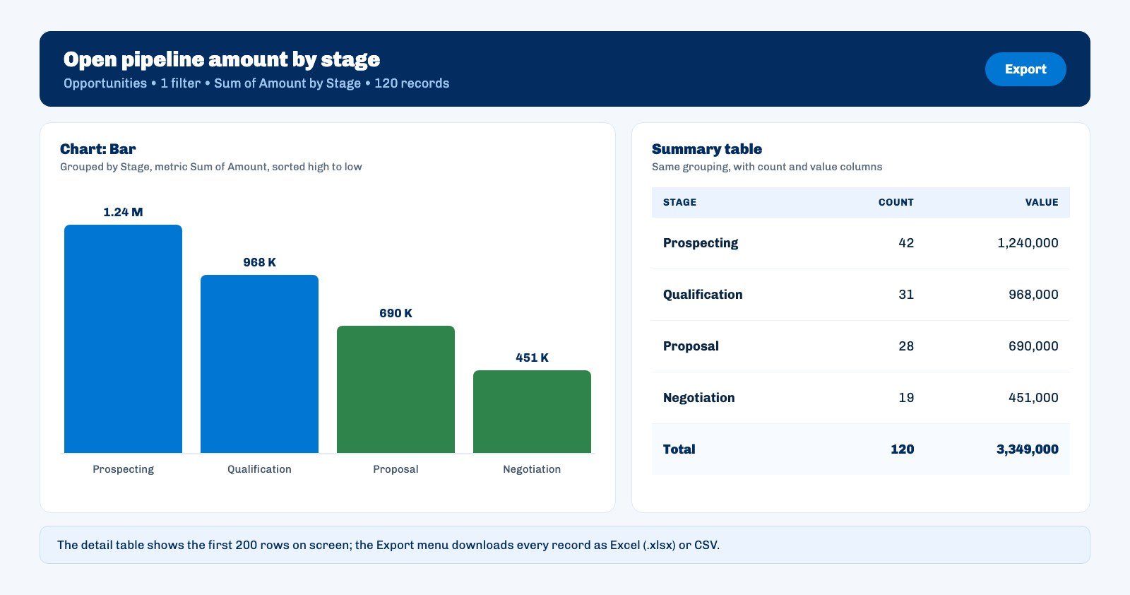
Two more controls sit above the chart and the summary table: a Hide button and an Export menu. The Hide preference is saved with the report, so a report built without a chart opens as a list every time. Export offers two formats: Excel (.xlsx) and CSV. The detail table shows the first 200 rows on screen, while the export carries every record.
Which reports ship ready to use?
Ohana360 ships with twenty four standard report templates, and they live in the Reports list with a Standard badge rather than on a separate tab. Templates are filtered by the active app, so opportunity templates never show up in Service.
On the sales side the ready ones include pipeline amount by stage, opportunity amount by owner, leads by source, leads by status and accounts by industry. Finance gets order and invoice amounts by status, service gets cases by status and by priority, and HR gets employees by department alongside expenses by category.
Opening a standard report loads it into the Report Builder, where you change whatever you like. The moment you press Save a new record is born with you as its owner, and the template itself stays untouched. Try to delete a template and the app tells you it cannot be removed.
Who can see a saved report?
Sharing is a single checkbox: ticked, everyone in the org sees the report; unticked, only you and the admins do. There is no middle tier, no folder and no role based sharing.
- Deletion rights: only the owner or an admin can delete a report. Anyone else trying to remove a shared report gets a warning.
- Renaming: the report name is editable inline in the Reports list, under the same rights rule.
- Copying: the Copy button in a saved report header creates a second record with "copy" appended to the name. That is the right way to experiment without breaking a team report.
- List columns: the Reports tab is a full list view with columns for report name, object, scope, grouping, chart, filter count, owner and last update. You can filter it by object, by type and by chart type.
What goes on a dashboard?
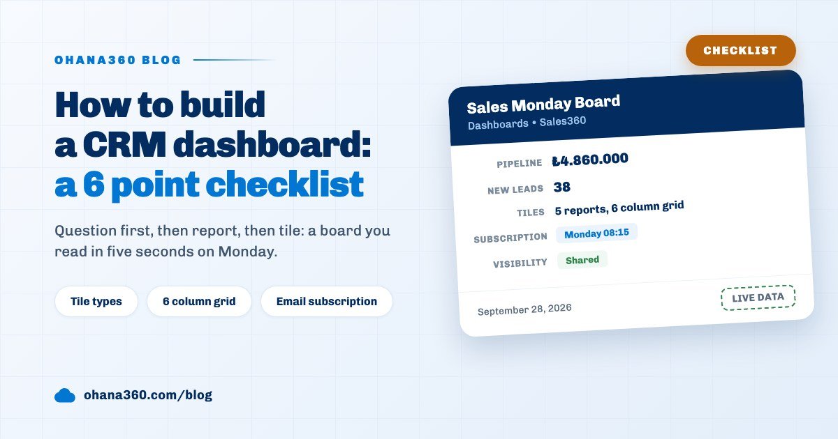
A dashboard is a six column grid that collects saved reports as tiles. Creating one asks for a name, an optional description, the reports to include and a sharing checkbox; it will not save without at least one report.
| Setting | Range | How you change it |
|---|---|---|
| Tile width | 2 to 6 columns | Drag the side handle in edit mode |
| Tile height | 1 to 7 rows | Drag the bottom handle, or both from the corner |
| Tile order | Free | Grab and drag a tile, or use the arrow buttons |
| Sharing | Personal or shared | Change it under Name and Sharing |
A tile follows the chart type of its report: a bar report becomes a bar tile, a donut report a donut with a legend, a table report a scrollable summary. A report without grouping renders as a card carrying one large number. With more than one report a summary strip appears on top, and clicking a cell scrolls down to that tile.
The Open in Builder link under a tile opens the report itself. Dashboards follow app scope: those built on shared objects appear everywhere, while app bound ones are listed only inside that app.
Can a report arrive by email on its own?
A saved report and a dashboard each carry an email subscription button in their header. The frequency is one of four: Daily, Weekdays, Weekly with a day you pick, and Monthly with a day of the month you pick.
- Timing: delivery happens at quarter past the hour you chose. Pick 08:00 and the report lands at 08:15.
- Contents: grouped reports arrive as a summary table of group, count and value; ungrouped ones carry the first 50 rows across at most eight columns.
- Dashboard subscription: the first six reports on the panel come stacked in one email.
- Deleted reports: if the report behind a subscription is gone, that send is skipped silently and no error mail goes out.
Subscriptions are personal: you open one for your own address and a colleague opens their own. There is no bulk way to push a report to everybody.
Not included: what the report builder does not do
Knowing the limits up front beats hitting an unexpected wall in week three. The items below are known boundaries rather than oversights.
- Standard reports cannot be edited or deleted. You open a template and save it under a new name; the original stays in the list.
- A report stays on one object. There is no report type that joins two objects or pulls fields from a related record. An opportunity report cannot show the account industry.
- Filters always combine with AND. The OR option and the custom logic expression available on list views do not exist on the report side.
- There are three chart types: bar, donut and table. No line, area, funnel, gauge or scatter chart is drawn.
- There are three metrics: record count, sum and average. No maximum, minimum, median or distinct count.
- Grouping has one level. No second breakdown and no matrix crossing rows with columns; numeric fields cannot be bucketed into ranges either.
- Exporting is limited to Excel and CSV. There is no PDF output and no way to download the chart as an image.
- Subscription emails send tables. No chart is embedded and no file is attached; a dashboard subscription carries six reports at most.
- A dashboard tile takes no filter of its own. The tile uses the filters of its report, and there is no panel level date or owner filter.
These limits share one reason: the report builder was kept narrow so it works without training. For questions that need deeper analysis, pulling the raw data into Excel or CSV and working there is still the shortest path.
Where should your first report start?
The right candidate for a first report is a number you currently count by hand at least once a week. For most teams that is open pipeline by stage or the total of overdue invoices.
Do this: open the pipeline template with the Standard badge on the Reports tab, add a lower bound on the close date filter, name it in the words your team actually uses, tick Shared and save. Then, on the Dashboards tab, pick that report plus two more into a single panel and set a subscription for Monday morning.
A month later ask one question: which tile does nobody look at? Remove it. Raising the number of reports is not the win; raising the number of reports people read is. The same measure holds on the customer segmentation and inventory tracking side.